When American basketball star LeBron James left the Cleveland Cavaliers for the Miami Heat in 2010, it was a huge blow to northeast Ohio. Perhaps no one was more wounded than the Cavaliers’ owner, Dan Gilbert, who posted an angry letter on NBA.com that declared James’ defection a “cowardly betrayal” and vowed that the Cavaliers would win an NBA title before James and the Heat did. It was a stirring message. Or it could have been, except Gilbert decided to publish it in Comic Sans.
The rise of the personal computer has made type connoisseurs of us all. This is a legacy of Apple founder Steve Jobs, who, before he dropped out of Reed College, audited a calligraphy course that inspired him to commission several original typefaces for his new computer operating system. Thanks to him, we all know that threats delivered in Comic Sans, a childish, comic book-like font, can’t be taken seriously.
“If you see the typeface before you see the words, there’s a problem with the typeface,” says John Kane, a professor of typography at Northeastern University. “Just as color doesn’t intrinsically mean anything, typography doesn’t intrinsically mean anything either. It’s the message that’s being delivered.”
The concept of fonts goes all the way back to the 1450s, when Johannes Gutenberg invented movable type and the printing press. Gutenberg made each letter by punch cutting: carving a letter in reverse on the end of a steel rod and then hammering it into a piece of softer metal to create a mold. Originally, a font was a complete set of letters. Today we use the term interchangeably with “typeface.”
Within a century, printers had dozens of typefaces to choose from. Since the early 20th century, however, plainer sans-serif fonts have come into fashion. Initially, they were popular because they looked clean and modern and because they were easy to read at a very large or very small scale, making them popular for both road signs and fine print on legal forms. The most famous of these was Helvetica, designed in Switzerland in 1957 to be legible and neutral. Within a decade it had become ubiquitous among corporations and governments who were quick to adopt it — there’s even a documentary on it.
GE didn’t use Helvetica, but it did have a sans-serif font for its websites and equipment: the proprietary GE Inspira. Designed in 2013, this family of typefaces was specifically designed for more robust typographic applications throughout GE, ranging from the interface on an MRI to operating instructions for a washing machine to a service manual for a jet engine. The font retains the core characteristics of the original GE Inspira, designed in 1993, but is more modern.
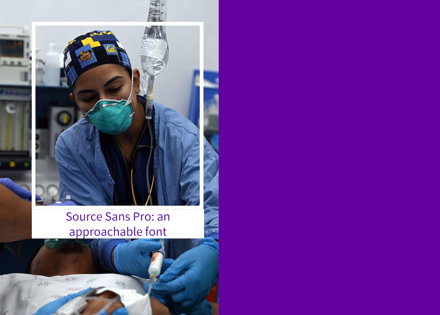
When GE HealthCare began rolling out its new rebrand as a standalone medtech company, it decided to use a new font — Source Sans Pro — to demonstrate its move away from a big industrial company to a uniquely healthcare identity. “There’s a roundedness that’s approachable,” says Maria Samodra, a creative director at Interbrand. “There’s a softness, but also precision.” This goes along with the GE HealthCare brand voice, which Craig Motlong, Interbrand’s director of creative identity, describes as “a compassionate creator, someone who sees something wrong with the world and rushes in to create something that wasn’t there before.”

Source Sans Pro also works on a practical level. The font will appear not just on GE HealthCare’s website and promotional materials but also on every piece of equipment and software the company manufactures. It needs to be legible even at a very small size, and it needs to be available in many alphabets. “It’s critical to have something that’s readable,” says Samodra. “Somebody’s life depends on this information.”
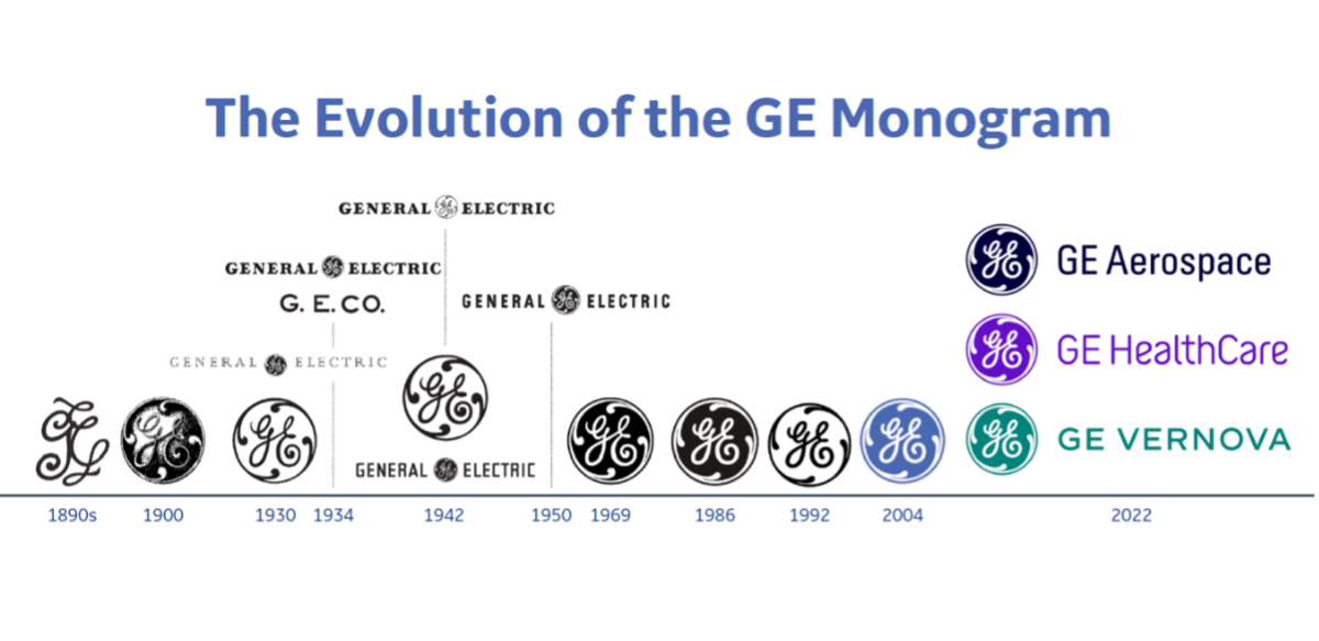
For its logo, GE HealthCare will maintain the traditional GE Monogram — scripted initials in a circle, like the filament in a lightbulb — which has been in use since 1898. The company’s name looks a little different, moving to a softer script, and in place of GE’s classic blue color scheme, the healthcare business has chosen “Compassion Purple.” The C in the company’s name has been capitalized to demonstrate the interdependency between better care and better health and the critical focus the company places on supporting both. By using the old, scripted GE logo, GE HealthCare is signifying that it’s continuing the GE tradition, while the color change announces it will do it in a new way.
A good choice of typeface, says Kane, “shows that you’re engaged with the moment, the here-and-now, and also some kind of future that no one can predict. When you pick a typeface and a typestyle, you reflect that sort of awareness.”
GE HealthCare will leave the Comic Sans approach to disgruntled basketball team owners. Their new typography approach signals a fresh beginning for the 130-year-old startup.